Florida’s state flag is what some flag enthusiasts might call “a seal on a bedsheet”. It’s that thing that way too many states and cities do, where they just put their official seal on the flag and call it a day. The problem with that approach is that it’s lazy, it looks like a lot of other flags, and it doesn’t do anything to make the flag their own. A good flag should be simple enough to draw by memory, but still easy to identify when it’s flying from a flagpole. It should be iconic and represent the people and the land it flies over. And it shouldn’t ever have the actual name of the state on it. If you have to tell everybody what state that flag is by putting the name on it, that’s simply a bad flag design.
Look at the flags of Ohio, Colorado, Tennessee, Arizona, Texas, and New Mexico. Those are some great state flags. But Florida’s flag? It suffers from that “seal on a bedsheet” problem along with too many other states. It’s also basically just the Alabama flag with that seal slapped on.
Come on Florida! We can do better!
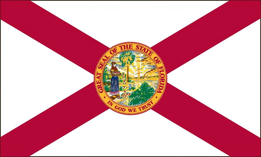
Florida’s flag might be recognizable at a glance once you see the red saltire and gold circle, but there’s still to much “stuff” going on in that state seal. You can’t see the details when the flag is flying in the breeze like a flag is supposed to do. Illinois, Connecticut, New Jersey, Virginia, and way too many other state flags have the same issue with bad design.
A great flag is something that can represent civic and state pride, and can even bring people together under it. Florida is a large and unique state with a high national profile. We can do better than our lazy “seal on a bedsheet”. Here are some cool and interesting state flag redesign ideas that would look great flying on any flagpole in Florida.
Sunshine State
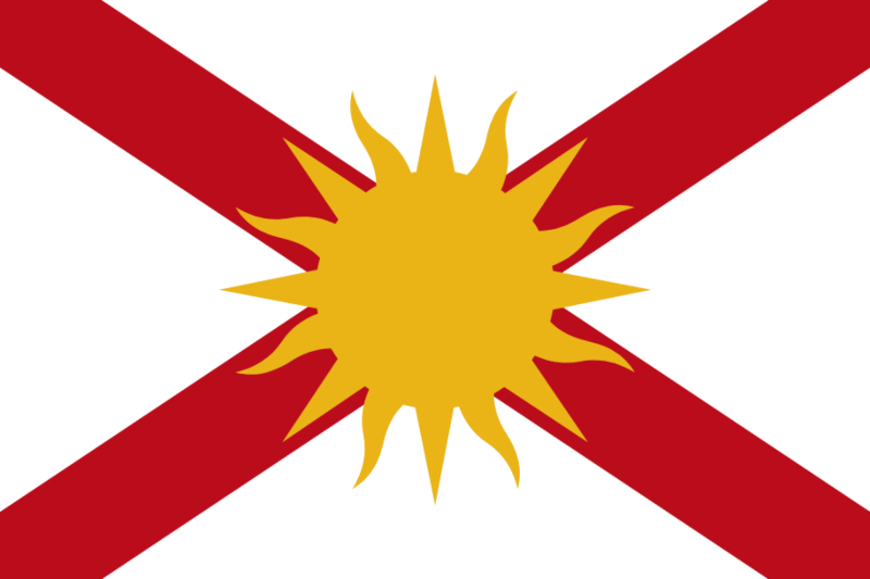
This fresh Florida flag redesign came from Deviant Art user RedAmerican1945. This design keeps the familiar red saltire, a nod to Spain’s role in settling in Florida, but replaces the busy state seal with a sun. This call to Florida’s nickname as The Sunshine State keeps most of the look and feel of the current flag, but while freshening it up. It simplifies it, yet makes it look a lot more iconic. The sun is still that same familiar gold color as the seal, so the change here is noticeable yet still easily recognizable as Florida’s flag. It would be really easy to picture this one as Florida’s official flag.
Spanish Cross of Burgundy

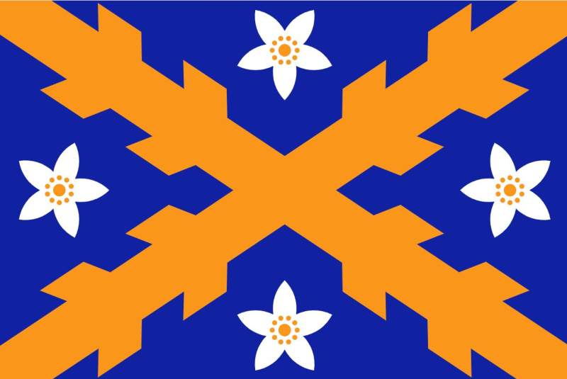
Here’s a fantastic design that was posted on /r/vexillology, a subreddit all about flags and their design. It’s a popular place on Reddit for flag enthusiasts and designers to come up with new ideas. This is a design that takes the current flags basic premise and just dials it up a few notches. The red saltire from the current design is replaced with the Spanish Cross of Burgundy. The Cross of Burgundy was the first flag to fly over Florida when it was a Spanish held territory, and it still flies over the Castillo de San Marcos National Monument in St. Augustine today. That’s a nice touch that pays respect to the state’s early history and separates the design a little bit from Alabama’s flag.
The state seal is replaced with the sun (again) to symbolize the Sunshine State, but with a graphic design that matches the cross.
The 27th State
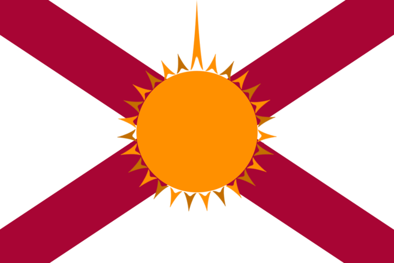
This is another familiar and comfortable looking design for a new Florida flag that takes the current design and replaces the seal with a sun. But in this case, there are 27 rays coming from the sun to indicate that Florida was the 27th state to join the union. That big sunray at the top is meant to stand out to represent Florida itself.
I don’t think the artist intended this, but that larger sunray could also represent a rocket, paying respect to Florida’s important role in the space program. It might also trigger a lot of folks with OCD.
Land of Flowers & Sunshine
Here’s an interesting concept that uses a red background to symbolize Florida’s early history as a Spanish settlement, then adds a layered image as a way to call out two of Florida’s nicknames. Florida has been called both “the land of Flowers” by the Spanish explorers, and the Sunshine State today by everybody else. So let’s combine those two into this one very striking design! This flag reminds me a little bit of New Mexico’s flag, which is probably one of the best state flags in the country. It might be a little too different than what we have now to ever fully replace it, but I like this as an example of good flag design.
Big & Bold

One of the big criticisms of Florida’s flag (apart from the seal), is that it’s very similar to Alabama’s flag. It’s basically the same exact flag, with the same red saltire, only with the state seal slapped on which makes it worse. This design by JacobMemeback at /r/vexillology corrects that problem by using the same basic color scheme but turning into something almost entirely new. Even if this flag replaced the current Florida flag today, it would still be identifiable as Florida’s flag. The sun that replaces the seal would instantly scream “Florida!” to anybody who saw it, while the bold red background gives the flag a whole new ilook. I really like this one, and could easily see this design become official.
Land & Sea

This is where things start to get a little different. Reddit user u/NathanTheMister came up with this design and explained the meaning behind all of the elements.
“The orange circle in the middle represents the state fruit, the Florida orange. The yellow circle surrounding the orange represents the sun of the Sunshine State. The green circle is broken into three strips of varying length to symbolize the three directional regions of Florida: North Florida (and the Panhandle), Central Florida, and South Florida. The three blue bars are an homage to the saltire on the current flag, but changed to blue to represent the three sides of Florida surrounded by water.”
It might be hard to picture our current flag being totally replaced by something like this, but clearly a lot of thought was put into the symbolism.
Land of Flowers
This one was designed by Adam A. Smith, a self-proclaimed “flag geek” and professor at the University of Puget Sound. Adam redesigned a bunch of state flags as part of a fun exercise in graphic design and came up with this for Florida.
“My redesign makes it obvious that the cross is the Spanish one, the Cross of Burgundy. I’ve done it in blue and orange: blue for the Florida waters (longest coastline among US states!), and orange for Florida’s agriculture. Florida’s very name means “flowery”, so I’ve completed the design with orange blossoms, Florida’s state flower, and another agricultural symbol. Hence, a design that combines the new and old that live side-by-side in Florida.”
FSU fans might take issue with the color scheme, but Gator fans are sure to love this one.
Orange Blossoms
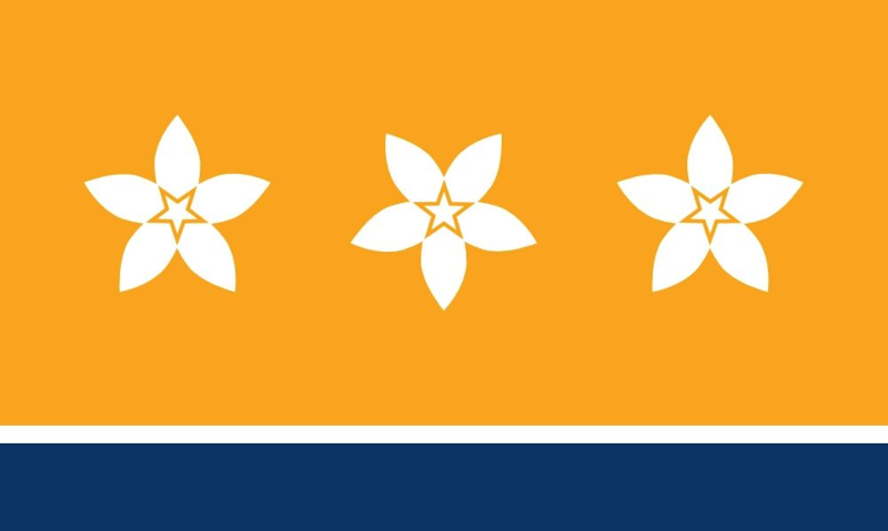
Here’s a wonderful and very imaginative redesign from Deviant Art user zmijugaloma.
“The flag is bright orange, as is Florida’s sun. The blue strip at the bottom symbolizes the seas Florida is surrounded with. In the middle, three orange blossoms evoke the meaning of the Florida’s name – flowery. The stars inside the flowers are the symbols of freedom, unity and prosperity.”
This is a great looking flag that would surely stand out among state flags. I could see this becoming an iconic symbol for the state, much like the flags of Chicago and Washington DC have. I love this design!
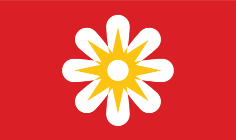
Orange & Sunshine
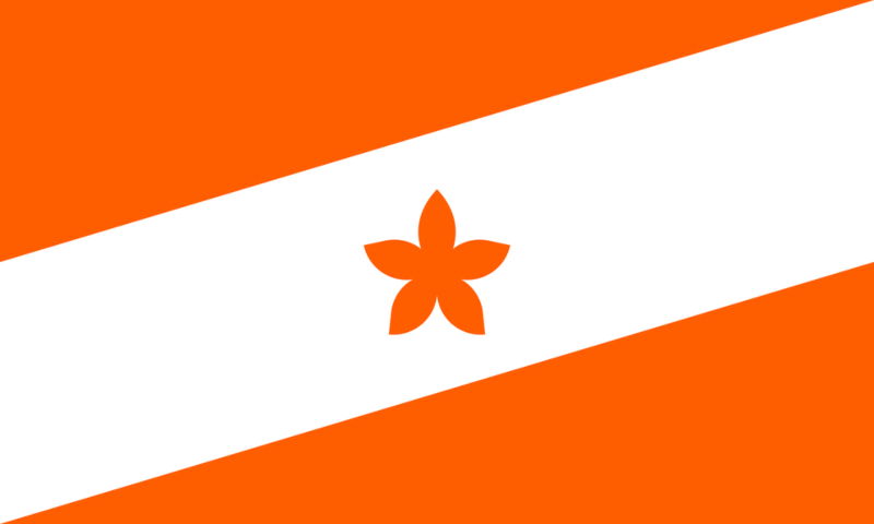
If replacing the state seal with the sun is a popular choice among flag designers, using the state flower in the flag is right up there too. And why not? Florida was called the “Land of Flowers” by the Spanish explorers who first arrived here.
This bold & simple design puts a lot of emphasis on Florida’s role as a sunny citrus-producing state with all that orange. That one star-shaped orange blossom in the center gives this flag a rather classic and easy to remember to look. It does look a little too much like a Diver Down flag to me though and think it could use maybe one more color in there to contrast with all of that orange.
Castillo de San Marcos
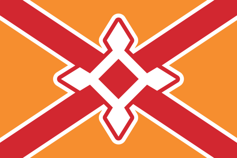
This clever design takes the foundation of the current flag, but adds orange and includes the outline of the Castillo de San Marcos in St. Augustine. The fort is a famous landmark in St. Augustine, Florida’s oldest city and one of the oldest European settlements in the United States. The Castillo de San Marcos has stood in St. Augustine since it’s completion in 1695.
The designer, /u/Trerrysaur from /r/vexillology, explains the different layers of symbolism in the flag: “The saltire is a symbol of strength and progress, and reflects the state motto, “In God We Trust”. It evokes the Cross of Burgundy, the Union Jack, and the Confederate Saltire. When it comes to the latter, it inverts the color, transforming the prejudice of the past into a symbol of unity: an intersection of sorts, representing Florida as an intersection of different cultures. The orange color symbolizes both sunshine and oranges, representing the state’s distinctive and iconic nickname and fruit. The white represents peace and honesty, while the red represents bravery and vitality. Lastly, the charge is a stylized silhouette of Castillo de San Marcos as viewed from above. The star fort was built between 1672 and 1695 to defend the city of St. Augustine, the first permanent European settlement in the United States, founded in 1565. Castillo de San Marcos is the oldest masonry fort in the entire United States.”
I love that this flag calls back to some of Florida’s earliest historical roots, with a bold yet simple design that would make this flag an instant icon.
Do you have a favorite of these that you’d like to see replace our “seal on a bedsheet” and become the new Florida state flag? Or maybe you love the one we have? Let us know in the comments!

